
To make a mood board, collect 15 to 30 images, colors, textures, and words that capture the feeling you want, then arrange them until a clear visual direction emerges. Group related items and leave breathing room. The board works when someone else can describe your project back to you accurately.
Mood boards get dismissed as arts-and-crafts time. That misses what they actually do. A mood board forces vague ideas (“cozy but modern,” “bold but trustworthy”) into concrete visual decisions before you spend money or commit to a direction. Interior designers, brand designers, and filmmakers all use them for the same reason: it is cheaper to argue with a board than with a finished room.
What Is a Mood Board Actually For?
A mood board is a collection of images, colors, textures, and words that defines a project’s visual direction. Its job is alignment: making sure everyone pictures the same thing when you say “modern farmhouse.” Without that shared reference, people fill in blanks differently, and differences surface late, when changes cost real money.
The board also filters decisions during the project. When you are choosing between two paint colors or two logo concepts, hold each against the board. The one that belongs is usually obvious. This is why the best boards feel opinionated rather than comprehensive. A board with everything on it decides nothing. A board with a clear point of view makes every later choice faster.
Where Do You Find Inspiration for a Mood Board?
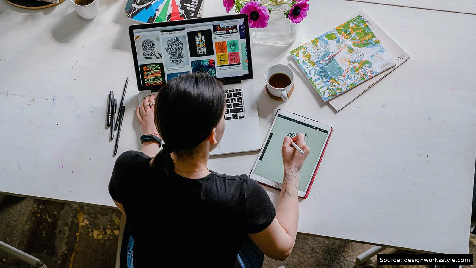
Gather from everywhere, not just design sources. Pinterest and Instagram are starting points, but also photograph real-life textures: a restaurant wall, a fabric, the light at a certain hour. Save packaging, screenshots, magazine pages. Aim for 30 to 50 raw pieces. You will cut half later; starting with abundance beats starting thin.
As you collect, notice patterns instead of judging individual pieces. If seven of your saved images have warm wood tones, that is data. If you keep saving the same shade of green, that is data. The collection phase is research: you are discovering what you actually like, which is often different from what you think you like. Do not curate yet. Save anything that sparks a reaction and sort it out later.
Should You Make a Physical or Digital Mood Board?
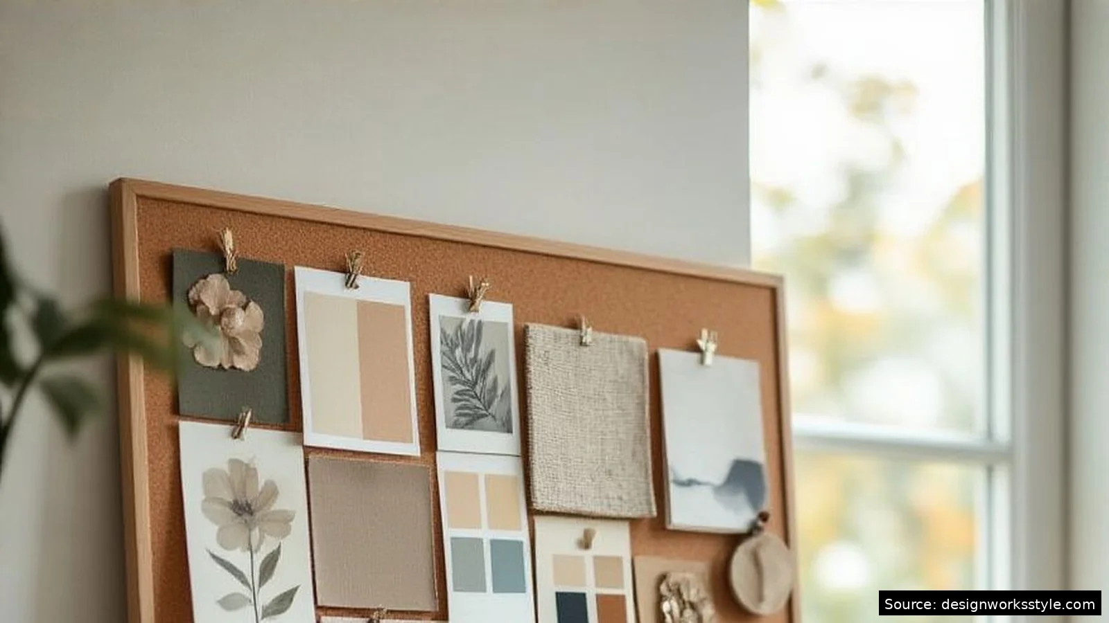
Physical boards (foam core, corkboard, a wall) suit tactile projects like interiors and fashion, where texture and true color matter. Pin swatches and photos, then live with the board for days. Digital boards (Canva, Pinterest, Milanote) suit brand and web projects: easy to share and rearrange. Neither is better. Match the medium to the project.
Physical boards have one advantage digital cannot match: you see true color and texture. Screens lie about both. If exact paint colors or fabric choices matter, print your images or use real swatches. Digital boards win on iteration speed. You can try three completely different directions in an hour, share a link for feedback, and never lose the earlier versions. Many designers do both: digital for exploration, physical for final decisions.
How Do You Arrange a Mood Board That Works?
Start with your strongest image and place it prominently. Build outward, grouping related items: warm tones together, textures together, typography in one zone. Overlap edges slightly so the board reads as one composition. Leave breathing room. A crammed board feels anxious; white space lets each element register.
Then edit ruthlessly. Remove anything that fights the dominant feeling, even if you love the individual piece. A single neon image on an otherwise muted board creates confusion, not contrast. The test: cover any one item with your hand. If the board still communicates the same mood without it, that item was decoration, not direction. Keep only what earns its place. Most strong boards end up with 12 to 20 pieces, not 40.
What Elements Belong on Every Mood Board?
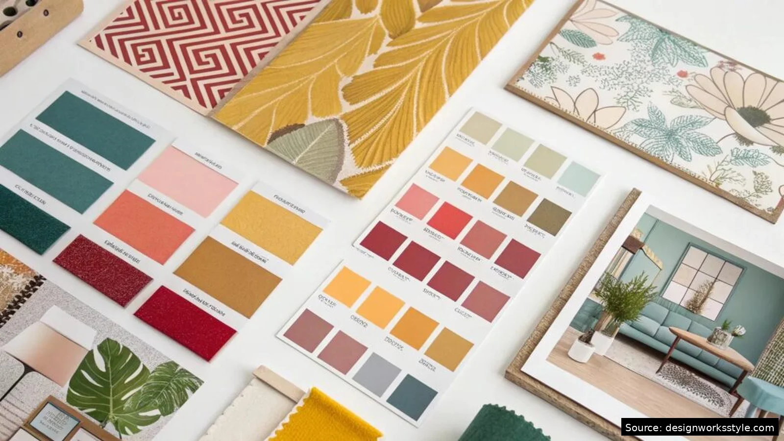
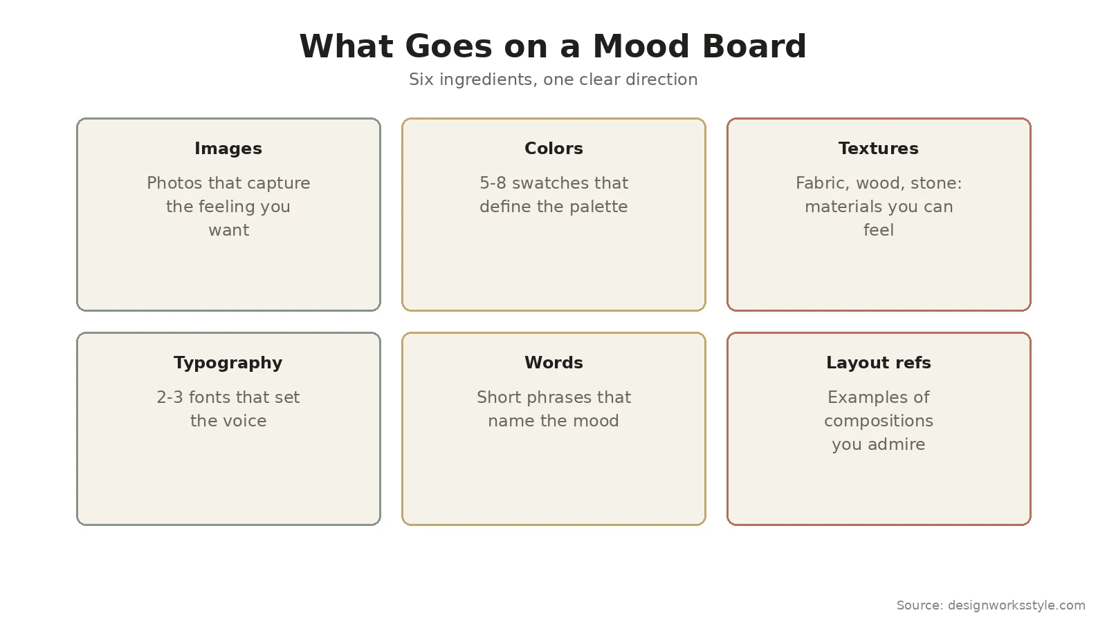
Every strong board needs six things: representative images, a color palette of five to eight swatches, texture samples, two to three typefaces, short words naming the mood, and one or two layout references. Miss the words and people misread the images. Miss the textures and a tactile project feels flat.
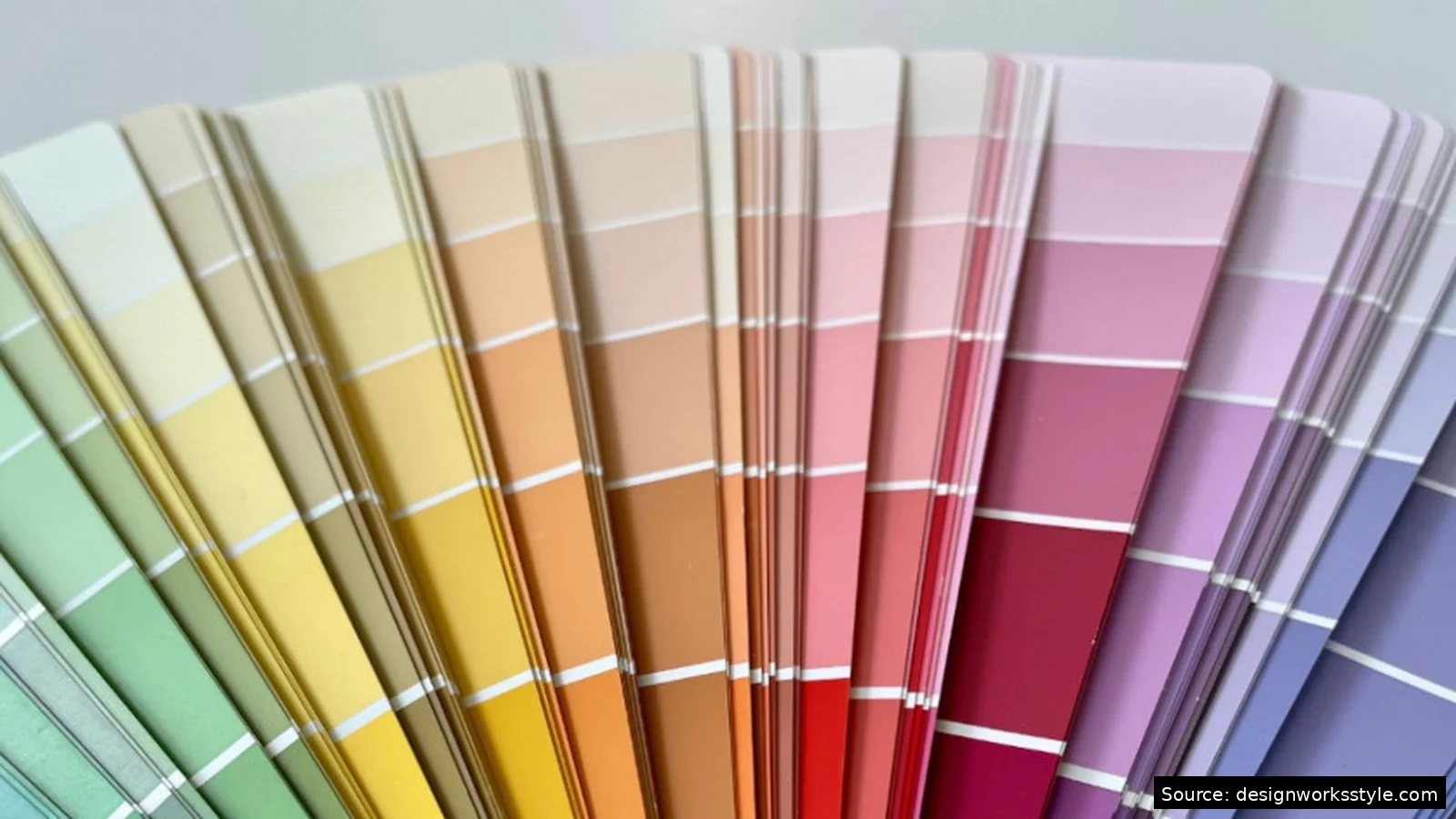
Color deserves special attention because it does the heaviest lifting. Pull your palette directly from your images using a color picker tool, then reduce to five to eight swatches: two or three dominants, two or three supports, one or two accents. Name the role of each. When someone asks why a particular green, you can point to the board and show it came from the images, not from nowhere. That traceability is what separates a mood board from a pretty collage.
How Do You Actually Use the Board Once It Is Done?
Keep the board visible for the entire project. Pin the physical board where you work; bookmark the digital one and open it daily. Compare every material, color, and font choice against the board side by side. If a choice clashes, either the choice is wrong or the board needs updating. You need the comparison to know which.
Share the board before presenting finished work. Walk clients or collaborators through it and get explicit agreement: “Does this capture what we are going for?” That conversation catches misalignments when they are cheap to fix. A client who approves the board has co-signed the direction, which makes later feedback more productive. “This does not match the board we agreed on” is a solvable problem. “This does not feel right” is not.
Frequently Asked Questions
How many images should a mood board have?
Collect 30 to 50 during gathering, then edit down to 12 to 20 for the final board. Fewer than 10 feels thin and unconvincing. More than 25 feels unfocused. The final count matters less than coherence: every piece should support the same direction. If removing an image does not change the board’s message, remove it.
What is the difference between a mood board and an inspiration board?
In practice, people use the terms interchangeably. Purists distinguish them: a mood board defines the emotional direction (feelings, atmosphere), while an inspiration board collects specific references (that chair, that layout). For most projects the distinction does not matter. What matters is that the board gives you something concrete to decide against.
Can I make a mood board for free?
Yes. Canva’s free plan works well for digital boards, and Pinterest boards cost nothing. For physical boards you need only a foam core board (a few dollars), printouts, and tape or pins. The expensive part of mood boarding was never the materials. It is the time spent gathering and editing, and that costs the same regardless of tools.
How do you present a mood board to a client?
Walk through it narratively, not as a pile of images. Start with the overall feeling, point to the two or three anchor images that define it, then explain the supporting choices: why these colors, why this typography, what the textures contribute. End by asking for reactions to the direction, not to individual pieces. You want “yes, this feels right” or “the colors feel too cold,” not a vote on each photo.