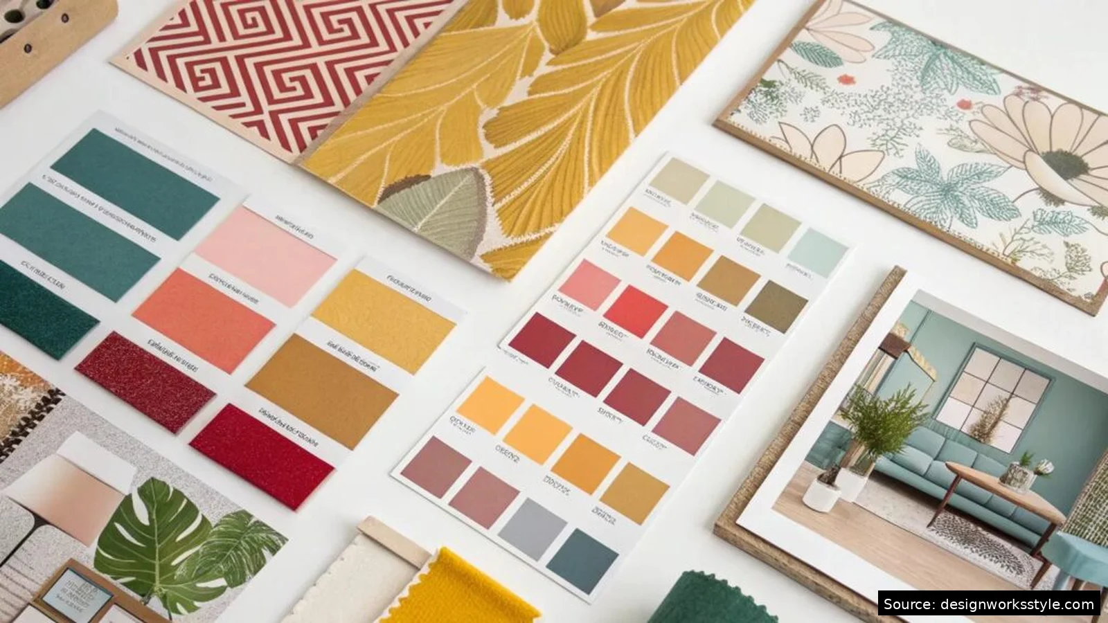

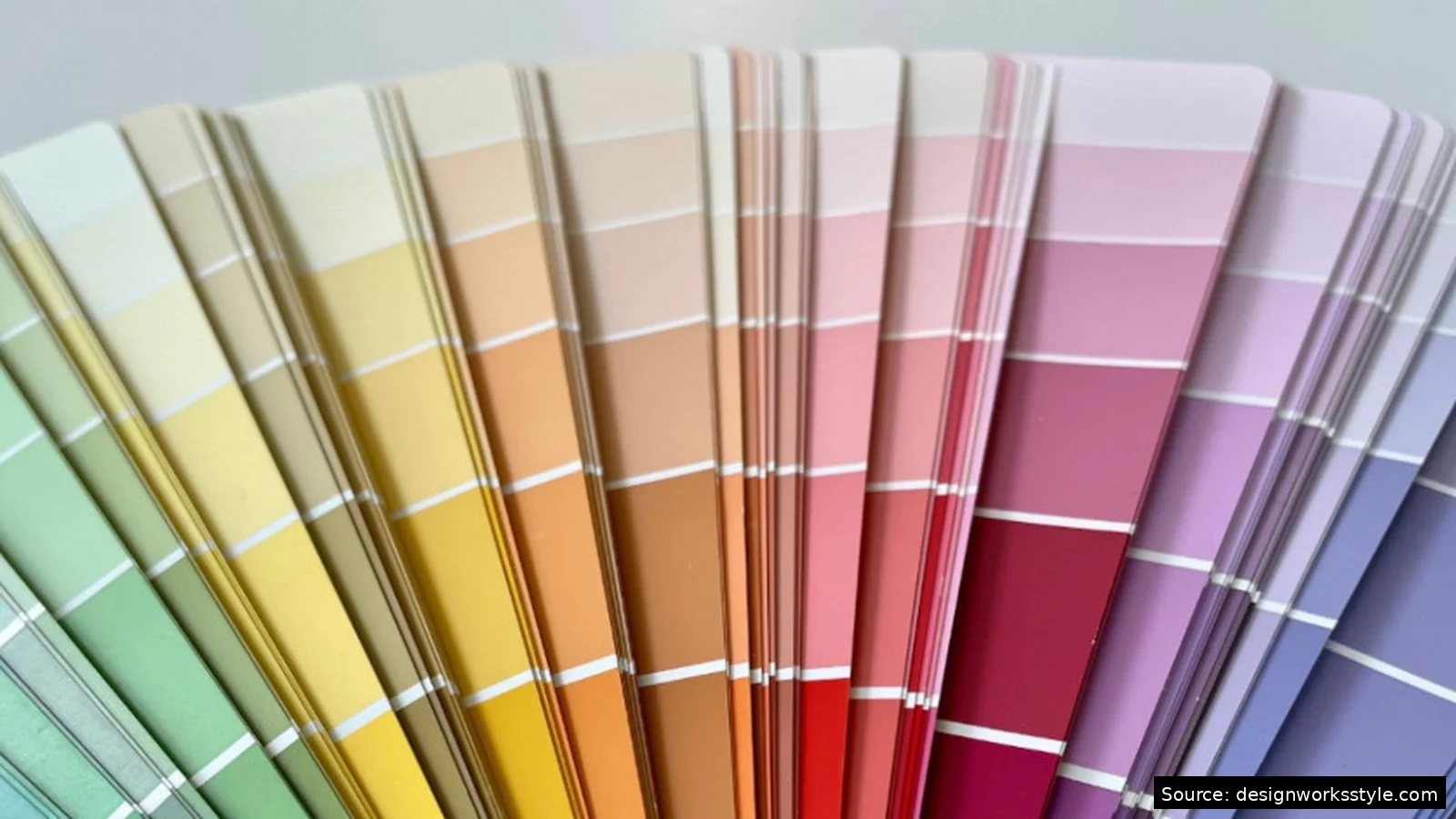
To create a working color palette, pick one base color matching the mood, build around it with a scheme (analogous for harmony, complementary for contrast), limit yourself to three to five colors plus neutrals, and test text contrast before finalizing. Free tools like Coolors and Adobe Color help generate and check. The method below walks through each step.
Most bad palettes fail for the same reasons: too many colors fighting for attention, no clear dominant color, or text that nobody can read. The fix is a repeatable process rather than better taste. Professional designers rarely start from a blank wheel; they start from a mood, an image, or a single color they love, then apply structure. Here is that structure, step by step.
Step 1: Define the Mood in Words First
Write three adjectives for how the project should feel before touching color. Calm, trustworthy, spacious suggests cool blues and soft neutrals. Bold, playful, energetic suggests warm saturated colors. This prevents the common failure of colors you like individually that say nothing together. Check every later decision against these words.
Consider the audience and context alongside the mood. A palette for a children’s brand and a palette for a law firm can share a hue but should differ wildly in saturation and value. Cultural associations matter too: white signals cleanliness in Western design and mourning in parts of Asia. If the project serves a specific audience, sanity-check your adjectives against their expectations, not just your own taste.
Keep the list visible while you work. Tape the three words to your monitor or write them at the top of your file. When a color choice feels tempting but does not serve the words, cut it. The adjectives are your creative director: they keep the palette honest when personal preference tries to take over.
Step 2: Pick One Base Color
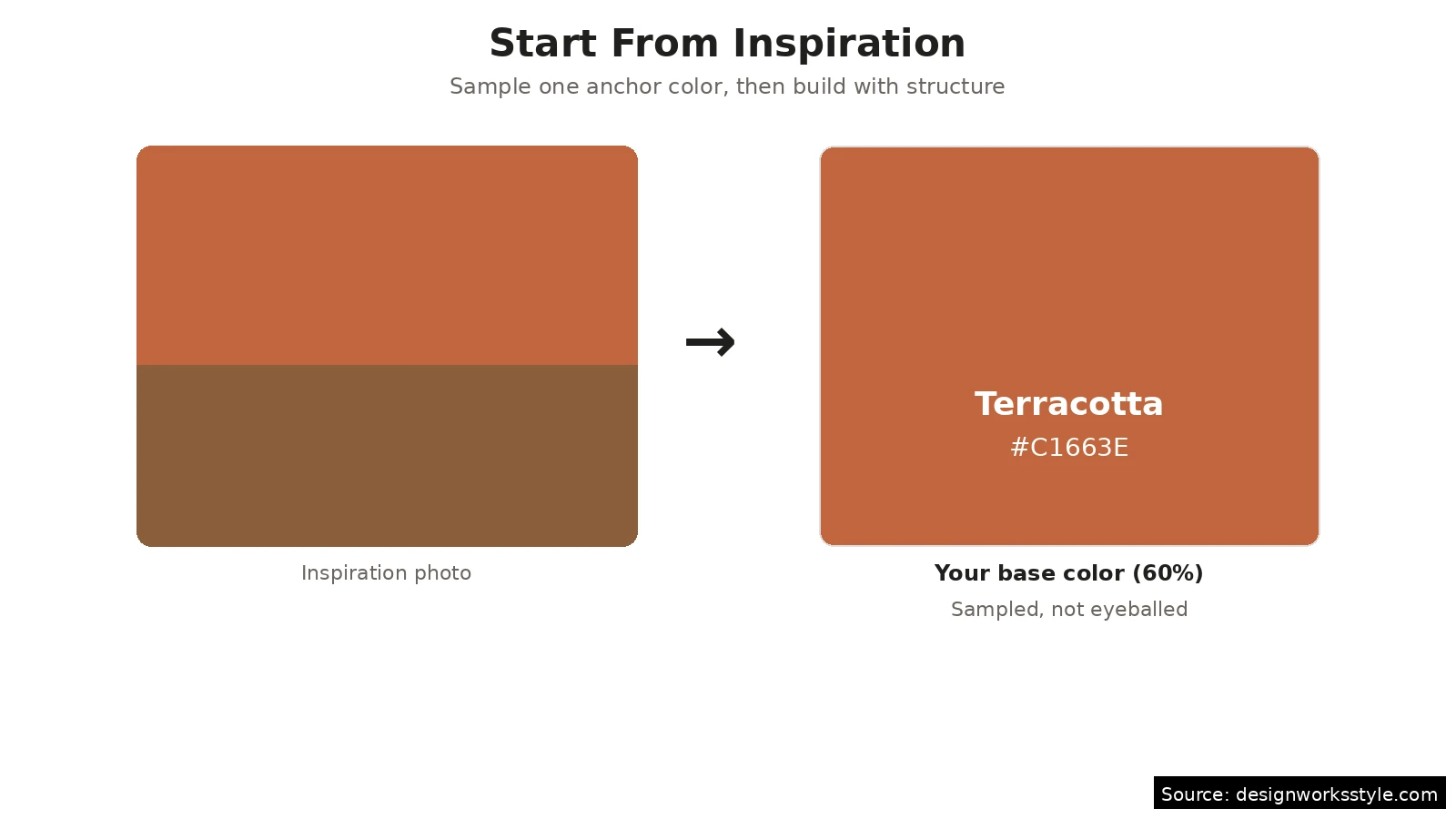
Choose one anchor color carrying the mood and commit to it as the foundation. Pull it from inspiration: a photo, a brand, a swatch. Sample it with a picker rather than eyeballing. It will cover about 60 percent of the design, so pick something livable at scale. Between two candidates, choose the more muted one; bold bases exhaust viewers quickly.
Test the base at large sizes before building on it. A color that looks perfect as a small swatch can feel overwhelming as a full background or wall. Mock it up at real scale: fill a page, a slide, or a wall section in your mind or in the tool. If it feels like too much, desaturate or darken slightly rather than abandoning the hue. The hue is usually right; the intensity is usually the problem.
Step 3: Build Harmony With a Scheme
Add two to four supporting colors using a wheel scheme anchored on your base. Analogous neighbors give harmony and are safest; the complement gives energy and a natural accent. A reliable structure: base, one analogous neighbor, complement accent, plus white, black, and one gray. Three chromatic colors and three neutrals handle nearly any project.
Worked example: a calm bakery brand
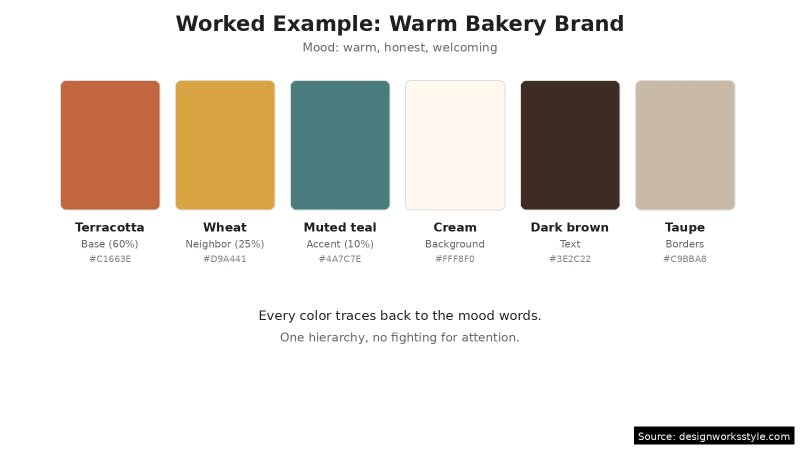
Say the mood words are warm, honest, and welcoming. The base: a warm terracotta sampled from a photo of baked bread. Analogous neighbor: a golden wheat tone for secondary elements. Complement accent: a muted teal for the logo mark and links, used sparingly. Neutrals: cream background, dark brown text, soft taupe for borders. Six colors total, one clear hierarchy, and every choice traces back to “warm, honest, welcoming.”
Step 4: Test Contrast and Accessibility
Check every text-background pair against WCAG ratios: 4.5 to 1 for normal text, 3 to 1 for large. Decorative colors can be anything, but readable text must pass. Free checkers test pairs instantly. View the palette in grayscale too: if hierarchy collapses, values are too close. Darken darks and lighten lights rather than swapping hues.
Do not forget color blindness, which affects about 1 in 12 men. Red-green distinctions vanish for the most common types, so never encode meaning in red versus green alone; pair the color with an icon, label, or shape. Simulators in tools like Adobe Color and browser extensions show your palette through different vision types. A palette that works for everyone is not a constraint on creativity; it is the baseline for professional work.
Step 5: Refine With Tools and Real Context
Generate variations and stress-test with free tools before committing. Coolors builds palettes from a base color and locks favorites while reshuffling the rest. Adobe Color extracts palettes from photos and checks color-blind safety. Mock up the palette at real scale: colors behave differently in context than as neat swatches, and mockups reveal hidden problems.
Useful free tools
- Coolors: fast palette generator with lock-and-reshuffle, contrast checker built in.
- Adobe Color: wheel-based builder, photo extraction, accessibility checks.
- WebAIM Contrast Checker: the standard for WCAG text contrast ratios.
- Your phone camera: photograph inspiration anywhere and sample colors later.
Save the final palette with names, hex codes, and usage notes: which color is the base, which is the accent, where neutrals go. Future you (or a collaborator) should be able to pick it up cold. Export from your tool of choice and keep one canonical version; palettes drift when five slightly different copies float around a project.
Revisit the palette after living with it for a week. Fresh eyes catch what tired eyes miss: an accent that seemed essential might be unnecessary, or a neutral might need warming. Good palettes often get simpler in revision, not more complex. If you can remove a color without losing anything, remove it. Restraint is what separates professional palettes from amateur ones.
Frequently Asked Questions
How many colors should a palette have?
Three to five chromatic colors plus two to three neutrals. That range covers a dominant color, supporting colors, and an accent without visual chaos. Brand palettes often sit at the low end; illustration and interior palettes can push higher. If you are tempted to add a sixth chromatic color, first check whether the hierarchy is clear enough with five.
Should I start from a photo or from scratch?
From a photo, especially as a beginner. Photos of things you find beautiful already contain working color relationships; sampling them gives you a proven starting point. Starting from a blank wheel demands more judgment about what “works.” As your eye develops, you will need the photo less, but even professionals keep image references for difficult projects.
What is the 60-30-10 rule?
A proportion guideline: 60 percent dominant color, 30 percent secondary, 10 percent accent. It prevents the indecision of equal splits and guarantees visual hierarchy. Apply it to web pages (background, sections, buttons), rooms (walls, furniture, accessories), or any composition. It is a starting ratio, not a law; 70-20-10 or 60-25-15 work fine when the design calls for it.
How do I know if my palette is accessible?
Run every text-background pair through a WCAG contrast checker (4.5:1 for normal text), view the design in grayscale to confirm value hierarchy, and simulate color blindness with a free tool. If all three pass, the palette is accessible. Accessibility is not a separate step to add later; build it into step 4 of the method above and it becomes routine.