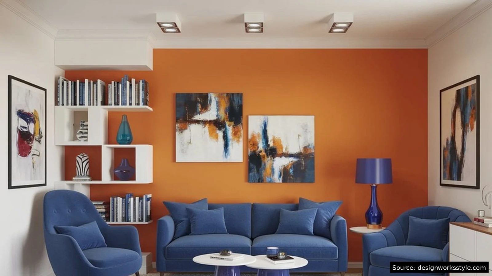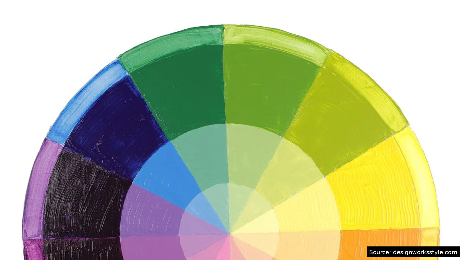

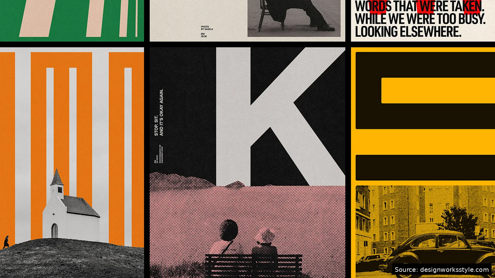
The seven essential design principles are contrast, alignment, hierarchy, balance, repetition, white space, and proximity. Together they explain why some layouts feel clear and professional while others feel chaotic. You do not need artistic talent to use them. Each principle is a practical rule about arranging text, images, and space so viewers understand your message instantly.
These principles show up everywhere: websites, posters, presentations, social graphics, even restaurant menus. They are not rigid laws. Experienced designers break them deliberately. But beginners should learn them first, because every effective rule-break starts from understanding what the rule does. This guide defines each principle with concrete examples you can apply to your next project today.
1. Contrast: Make Different Things Look Different
Contrast means making distinct elements look clearly distinct. Big versus small, dark versus light, bold versus regular. Without enough contrast, everything blends into visual mush and viewers cannot tell what matters. The most common failure is timid contrast: a headline slightly larger than body text, or dark gray text on a medium gray background. Push differences further than feels comfortable.
Apply contrast to size, weight, color, and spacing. Your headline should be dramatically larger than supporting text, not marginally larger. Key information gets bold weight or a contrasting color. Related but secondary items stay quiet. One caution: contrast needs a purpose. Random bright colors on every element create noise, not clarity. Decide what should stand out first, then give only that element the strong treatment.
2. Alignment: Line Things Up
Alignment means placing elements along shared edges or centers so nothing looks randomly positioned. Left-align text blocks, align images to the same margin, line up headlines with the content below them. The eye unconsciously tracks these invisible lines, and consistent alignment makes a layout feel organized even before anyone reads a word. Centered everything is the usual beginner mistake.
Pick one primary alignment per layout and stick with it. Left alignment suits most text-heavy designs because Western readers scan left to right. Center alignment works for formal invitations and short ceremonial text, but weakens longer content. Use your software’s alignment guides: drag elements until they snap to shared edges. If two things are almost aligned but not quite, it looks like a mistake. Make them exactly aligned or clearly offset.
3. Hierarchy: Guide the Eye
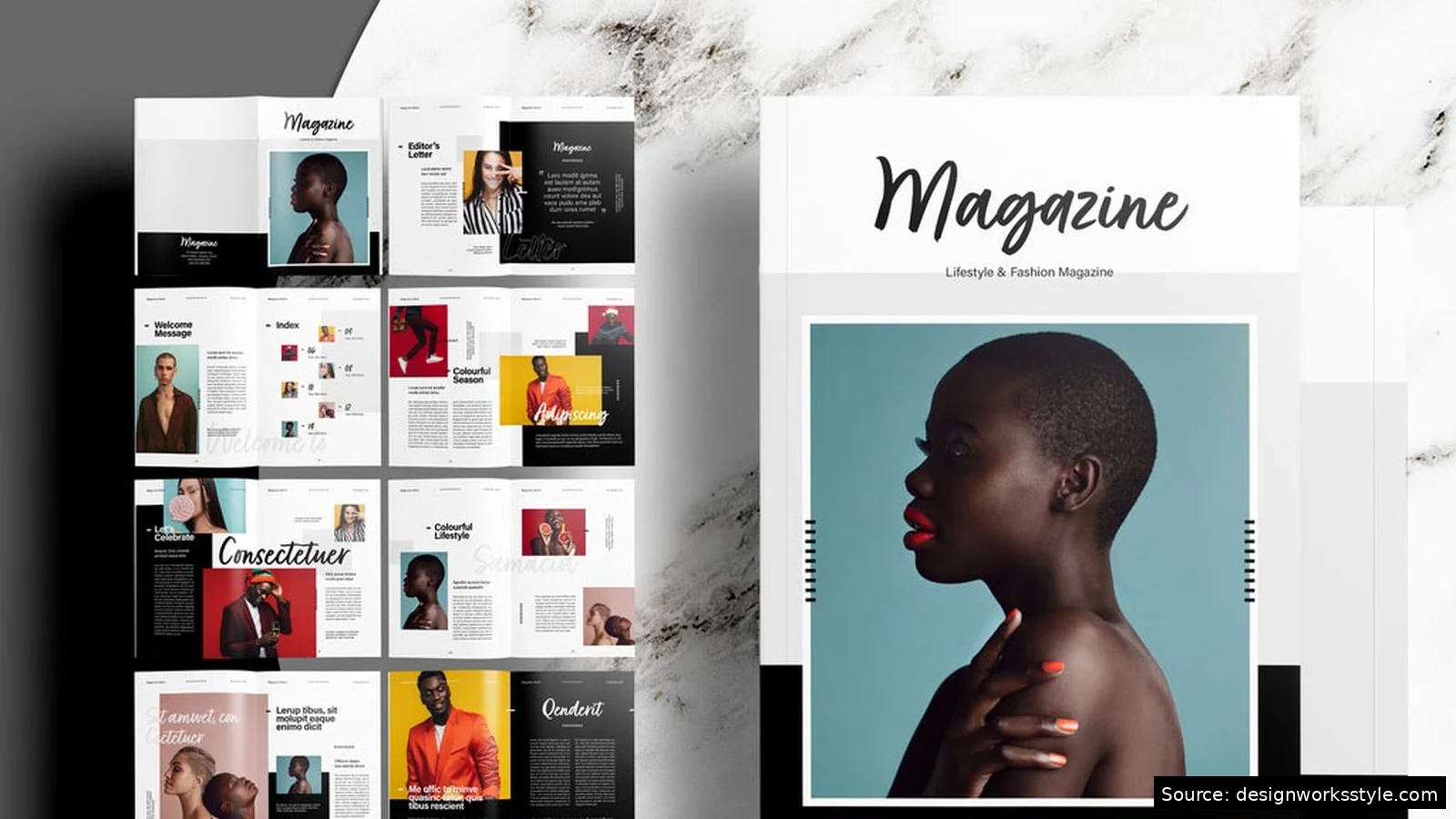
Hierarchy controls the order in which viewers notice things. The most important element should grab attention first, the second most important next, and so on. You build hierarchy with size, color, weight, and position: bigger, bolder, and higher-contrast items read first. Every design needs a clear entry point. If three elements compete equally for attention, viewers notice none of them.
Test your hierarchy with the squint test. Squint at your design until details blur. What do you still see? That is your actual hierarchy, regardless of what you intended. The headline or hero image should survive squinting. Body text should fade. If supporting details shout as loudly as the headline, demote them: smaller size, lighter weight, muted color. Three levels of hierarchy (primary, secondary, body) handle most designs.
4. Balance: Distribute Visual Weight
Balance means distributing visual weight so no part feels heavier than the rest. Large, dark, or colorful elements carry more weight. Symmetrical balance (mirrored halves) feels formal and stable. Asymmetrical balance feels dynamic and modern. Both work. What fails is accidental imbalance, where everything piles into one corner.
Think of your layout as a seesaw. A large photo on the left balances against several smaller text blocks on the right. A dark headline at the top balances against a colorful image at the bottom. When something feels “off” but you cannot say why, check the weight distribution. Often the fix is simple: move one element, resize another, or add white space to the heavy side to let it breathe.
5. Repetition: Create Unity Through Consistency
Repetition means reusing the same colors, fonts, and styles so separate parts feel like they belong together. Use the same heading font on every page. Repeat your accent color in headlines and icons. This consistency makes a document or social feed look like one coherent brand. Repetition builds recognition.
The line between repetition and monotony is variation within the system. Repeat your two brand fonts, but vary their sizes and weights for hierarchy. Repeat your color palette, but use different colors for different purposes. A template system (Canva’s brand kits, PowerPoint masters) enforces repetition automatically. Set yours up once and every new design starts consistent. Without a system, repetition depends on memory, and memory drifts.
6. White Space: Let Content Breathe
White space is the empty area around and between elements. It is not wasted space. It separates ideas, reduces noise, and makes important elements stand out. Beginners fear empty areas and fill every corner. The result feels cramped. Generous margins signal confidence and make content easier to scan.
Add white space deliberately. Increase line spacing so paragraphs do not feel dense. Give headlines room above and below. Separate sections with clear gaps rather than divider lines. When a layout feels crowded, the fix is almost never a smaller font or a bigger canvas. It is removing something or spreading things out. If everything is important, nothing is. White space is what lets importance show.
7. Proximity: Group Related Items
Proximity means placing related items close together and separating unrelated ones. Viewers assume nearby things belong together. A caption sits directly under its photo. Form labels hug their input fields. When related items drift apart, viewers must work to connect them, and most will not bother.
Use proximity instead of boxes and lines to show grouping. Beginners draw rectangles around everything, which adds visual clutter. Simply moving related items closer and pushing groups apart communicates the same structure more elegantly. Check your spacing in three tiers: tight within a group (a headline and its subhead), medium between groups (sections), large between major areas. Consistent spacing tiers make structure obvious.
How Do the Principles Work Together?
The principles overlap in every good design. Hierarchy uses contrast to rank elements. Proximity and alignment show structure together. Repetition makes hierarchy predictable across pages. White space strengthens all of them by removing noise. A strong headline uses contrast, hierarchy, alignment, and white space simultaneously.
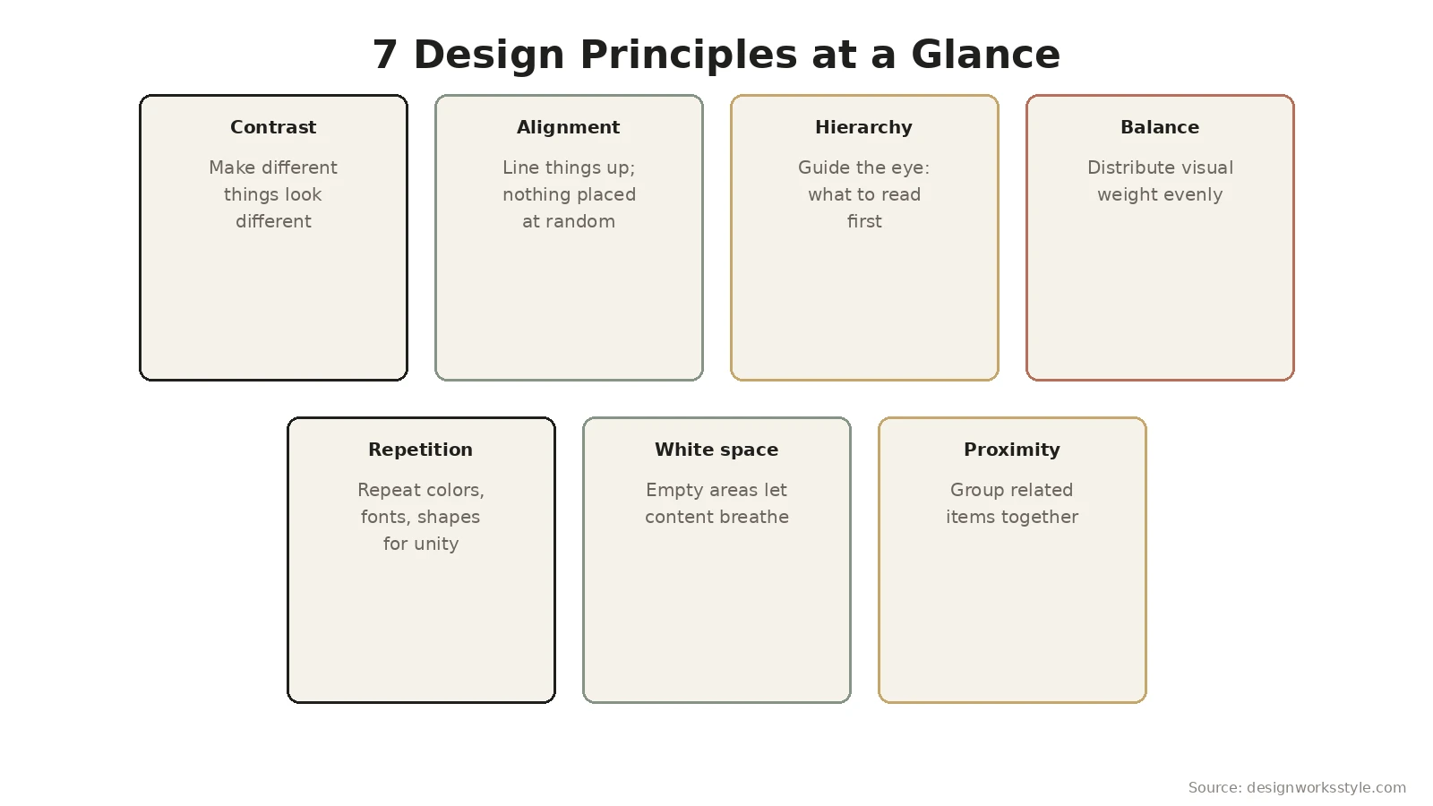
When reviewing your own work, run through the list as a checklist. Is there enough contrast between levels? Is everything aligned to something? Does the eye land where you want first? Is the weight balanced? Are fonts and colors consistent? Is there breathing room? Are related items grouped? Most beginner designs fail two or three of these. Fix those and the design transforms without any new artistic skill.
Frequently Asked Questions
Do I need to follow all 7 principles in every design?
They apply whether you think about them or not. Every design has some amount of contrast, alignment, and spacing. The question is whether those choices are deliberate or accidental. You do not need a checklist for a quick social post, but internalizing the principles means your instincts improve. The checklist matters most when something feels wrong and you need to diagnose why.
What is the most common beginner design mistake?
Timid contrast combined with centered everything. Beginners make headlines slightly bigger than body text, center all of it, and fill every corner. The fix covers three principles at once: push size differences further, pick left alignment, and delete or space out a third of the elements. That single pass fixes most amateur-looking layouts.
Can you break design principles intentionally?
Yes, once you understand what each principle does. Deliberate misalignment creates energy. Intentional imbalance draws attention. But the break must serve the message. Random misalignment looks like a mistake; strategic misalignment looks like style. If you cannot explain why you broke the rule, follow it. The principles are defaults, not handcuffs.
How long does it take to learn these principles?
The concepts take an afternoon. Applying them instinctively takes a few months of practice. Speed up the process by analyzing designs you admire: identify which principles they use well. Redesign something ugly using the checklist. The fastest learners are the ones who compare before-and-after versions of their own work and can name what changed.