
Color theory is the set of rules for how colors mix, match, and affect each other. The color wheel organizes 12 colors: 3 primary, 3 secondary, 6 tertiary. Warm colors (reds, oranges) advance while cool colors (blues, greens) recede. Every color has a hue, saturation, and value. Learn these ideas and most design color choices get easier.
You do not need a design degree to use color well. You need about fifteen minutes with the color wheel and a willingness to test combinations before committing. This guide covers the pieces that actually matter in practice: how the wheel is built, why some colors feel warm and others cool, the three properties that define any color, and the simple schemes designers reach for daily.
What Is the Color Wheel?
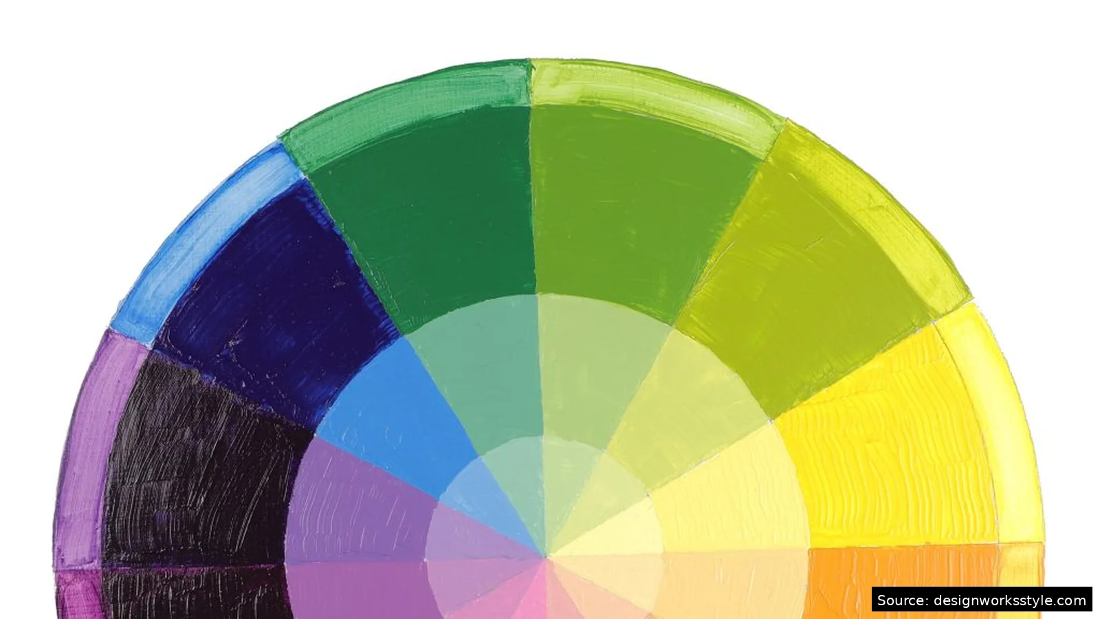
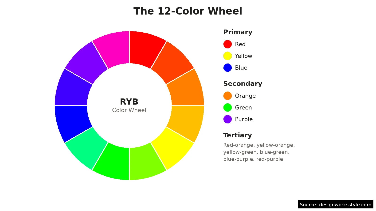
The color wheel is a circular diagram arranging 12 colors by relationship. Three primaries (red, yellow, blue) sit equidistant. Mixing two primaries makes three secondaries: orange, green, purple. Mixing a primary with a neighboring secondary produces six tertiaries like red-orange. The wheel’s job is showing relationships: neighbors harmonize, opposites contrast.
The wheel most designers use today descends from Isaac Newton’s 1706 color circle, refined through centuries of paint mixing. The version you will see in design tools is the RYB (red-yellow-blue) wheel for traditional pigment, though screens use RGB (red-green-blue) and printers use CMYK. For choosing palettes, the relationships hold across all three models: opposites contrast, neighbors harmonize, and spacing predicts the mood.
What Are Warm and Cool Colors?
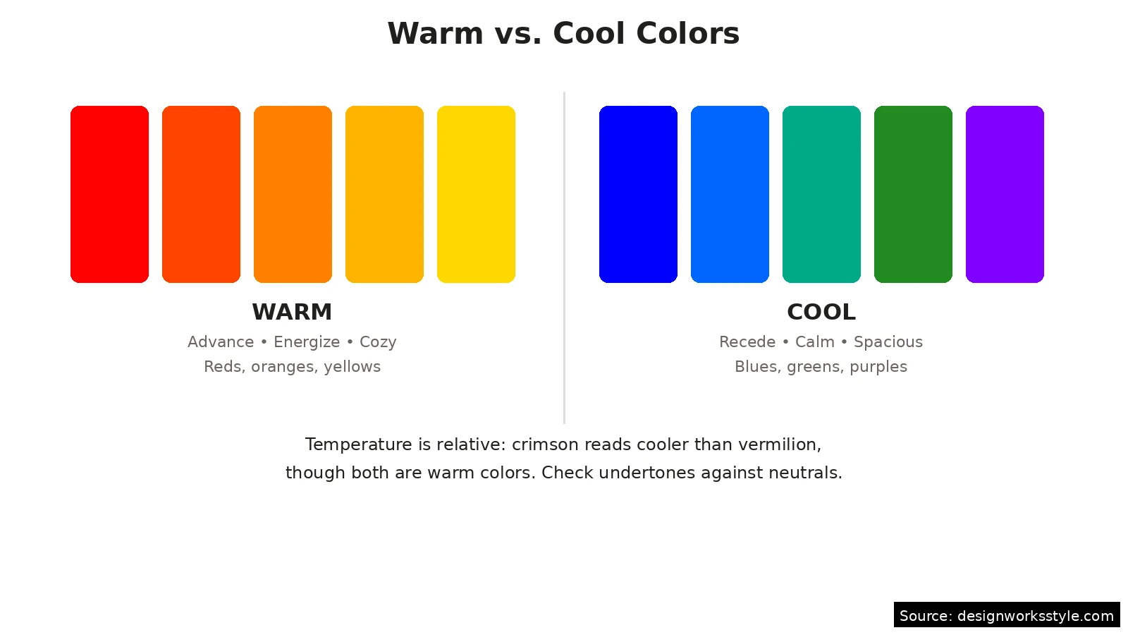
Warm colors (reds, oranges, yellows) occupy one half of the wheel; cool colors (blues, greens, purples) the other. Warm colors advance toward the viewer and feel energetic. Cool colors recede and feel calm. A small room in warm white feels closer; in cool white, larger. Temperature is relative: a crimson red reads cooler than vermilion.
Temperature is relative, not absolute. A red with blue undertones (crimson) reads cooler than an orange-red (vermilion), even though both are “warm” colors. Designers exploit this constantly: a “warm gray” for a cozy living room has beige undertones, while a “cool gray” for a modern office leans blue. When someone says a color feels off, the undertone temperature is usually the culprit. Check any color against true neutrals to see which way it leans.
What Are Hue, Saturation, and Value?
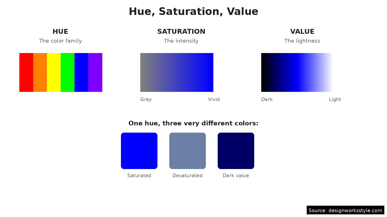
Hue, saturation, and value fully describe any color. Hue is the color family (red, blue, green), measured as a wheel position. Saturation is intensity, from vivid to gray. Value is lightness, from near-black to near-white. A saturated red shouts; desaturated, it whispers; darkened, it turns serious. When a palette feels wrong, check saturation before swapping hues.
These three properties explain why “blue” can mean a hundred different things. Navy and sky blue share a hue but differ in value. A dusty blue and an electric blue share hue and value but differ in saturation. When a palette feels wrong, identify which property is off before swapping hues. Often the hue is fine and the saturation is the problem: beginners routinely pick colors at full saturation when the design calls for something muted.
Most design tools expose these as HSB or HSV sliders (hue, saturation, brightness). Learning to adjust one slider at a time is the fastest way to build intuition. Take a color you like, then drag saturation down until it feels calm, or drag value down until it feels weighty. Watching a single property change in isolation teaches more than any definition.
What Are the Basic Color Schemes?
The three essential schemes: monochromatic (one hue in varied saturation and value), analogous (three wheel neighbors), and complementary (two opposites). Monochromatic is safest and most cohesive. Analogous feels natural, like a forest. Complementary gives the strongest contrast. Master these three before trying complex arrangements.
Monochromatic: one hue, many moods
Pick a single hue and vary its saturation and value. A deep navy header, medium blue body text accents, and pale blue backgrounds form a complete monochromatic scheme. It cannot clash because there is only one hue to clash with. The risk is monotony, so push the value range wide: pair very dark with very light rather than hovering in the middle. Monochromatic schemes suit minimal designs, corporate identities, and anywhere calm authority matters more than excitement.
Analogous: neighbors on the wheel
Choose three colors that sit next to each other, like blue, blue-green, and green. Analogous schemes feel cohesive because the hues share undertones, and they show up constantly in nature, which is why they read as pleasing without effort. Give one color the lead role and let the other two support: a common split is 60 percent dominant, 30 percent secondary, 10 percent accent. Avoid equal thirds, which can look indecisive.
Complementary: opposites attract
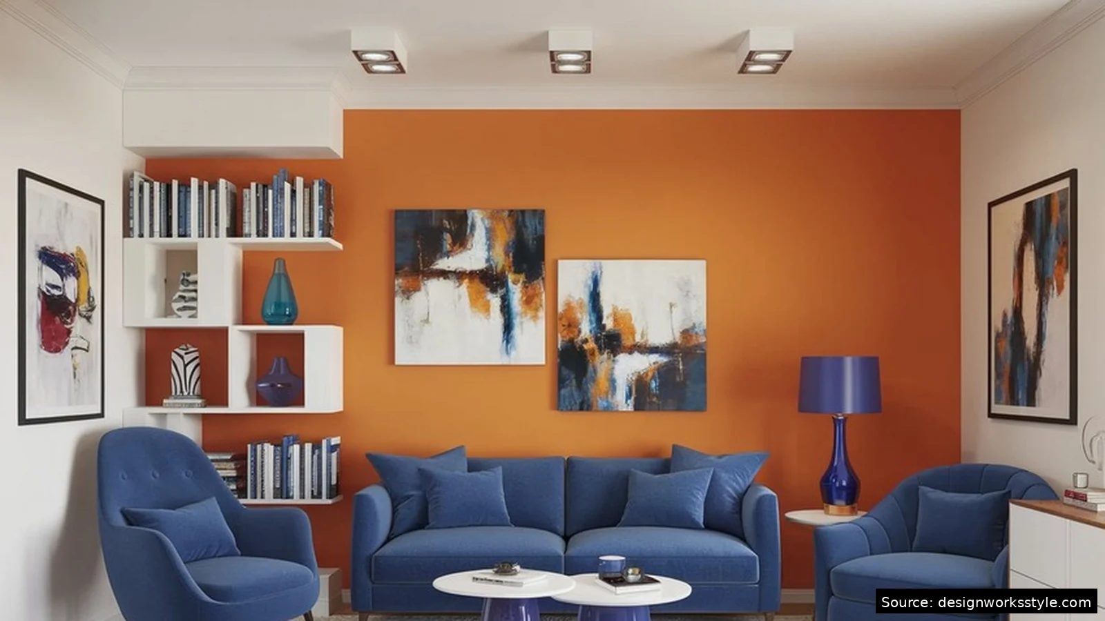
Pair colors from opposite sides of the wheel: blue and orange, red and green, purple and yellow. The contrast makes each color look more intense, which is why sports teams and fast-food logos love this scheme. The danger is vibration, where the two colors seem to buzz against each other at full saturation. Fix it by muting one of the pair: a burnt orange with navy works where pure orange with pure blue would hurt.
How Do You Actually Choose Colors for a Project?
Start with the mood, pick one anchor color, then build outward with a scheme. Calm projects anchor on cool hues; energetic ones on warm. Use analogous for harmony, complementary for punch. Check practical constraints: text needs contrast, and the palette should work in grayscale. Two or three colors plus neutrals handle most projects.
Steal like a designer while learning. Find a photo, painting, or website whose colors you admire and sample its palette with a color picker tool. Ask why it works: usually you will find an analogous base with one complementary accent, or a monochromatic scheme with one warm highlight. Reverse-engineering good palettes builds faster intuition than theorizing. Keep a swipe file of palettes you like, with notes on what each one does well.
Frequently Asked Questions
What is the difference between hue and color?
Hue is the pure color family (red, blue, yellow) without any adjustment. “Color” in everyday speech usually means the full package: a specific hue plus its saturation and value. So navy and sky blue share a hue but are different colors. In design tools, the hue slider picks the family and the other sliders refine it.
How many colors should a palette have?
Three to five, plus neutrals. One dominant color, one or two supporting colors, and one accent is the classic structure. Add black, white, and one or two grays for text and backgrounds. More than five chromatic colors usually fights for attention; if you think you need more, you probably need clearer hierarchy instead.
Do warm and cool colors really affect mood?
They influence perception reliably enough to design with, though the effects are tendencies, not laws. Warm colors consistently test as more stimulating and intimate; cool colors as calmer and more spacious. Context matters enormously: a warm red in a restaurant feels appetizing, the same red in a hospital waiting room feels alarming. Test in context, not in isolation.
What is the easiest color scheme for beginners?
Monochromatic. Pick one hue you like, then use very dark, medium, and very light versions of it. It cannot clash, it always looks intentional, and it teaches you to see how much variety saturation and value alone can create. Once monochromatic feels easy, try analogous by adding one neighboring hue.