
Photography composition is the arrangement of everything inside your frame: what you include, what you leave out, and where each element sits. Strong composition guides the viewer’s eye to your subject, creates balance or deliberate tension, and turns a snapshot into a photograph. It matters more than camera settings, and it costs nothing to learn.
This guide covers the techniques working photographers actually use: leading lines, framing, negative space, symmetry, and more. If you are learning in order, our photography basics guide puts composition after light and camera settings.
What Composition Actually Is
Composition is the set of decisions you make about arrangement before pressing the shutter: where the subject sits, what supports it, what gets excluded, and how the eye travels through the frame. Camera settings control exposure and focus. Composition controls meaning: what the viewer notices first, second, and not at all.
Think of it as visual weight. Every element in the frame pulls the eye with a certain force. Bright areas pull harder than dark ones, faces pull harder than objects, sharp pulls harder than blurry. Good composition distributes that weight deliberately: the eye lands on the subject first, then explores the rest in your intended order.
Two photographers can stand in the same spot and come home with completely different photos. Same light, same camera. The difference is entirely compositional, and that gap closes faster than most beginners expect.
The Core Techniques
The core composition techniques are the rule of thirds, leading lines, framing, negative space, symmetry and patterns, foreground interest, and viewpoint. Each solves a specific problem: placement, guidance, depth, or simplicity. Learning three or four of them changes your photos immediately.
Start with these. They are not laws, but they have survived because they work:
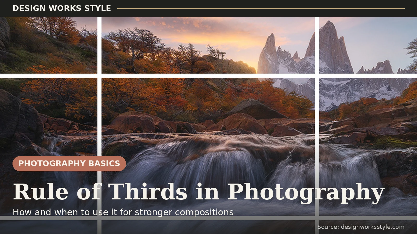
- Rule of thirds: place key elements on the grid lines or intersections instead of centering everything. The fastest cure for static, bullseye compositions.
- Leading lines: roads, rivers, fences, shadows that pull the eye toward your subject. The eye follows lines without being asked.
- Framing: use doorways, arches, branches, or windows to frame the subject within the frame. Adds depth and context in one move.
- Negative space: empty areas that give your subject room to breathe. Sets the mood.
- Symmetry and patterns: reflections, architecture, repeating shapes. The deliberate exception. Center these on purpose.
- Foreground interest: something in the near foreground that adds depth, especially in landscapes.
- Viewpoint: your physical position. Crouching, climbing, or stepping sideways changes the photo more than any setting. Do not shoot everything from standing eye height.
Leading Lines in Practice
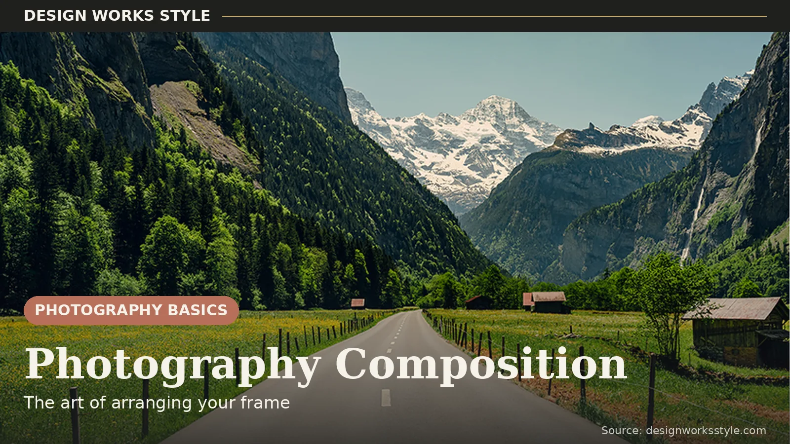
Leading lines are lines in the scene, roads, rivers, fences, shadows, shorelines, that pull the viewer’s eye toward your subject. They work because the human eye follows lines automatically. Place your subject where the lines converge or lead, and the viewer arrives exactly where you intended.
Diagonal lines feel dynamic; converging lines, railway tracks narrowing to the horizon, create depth; curved lines feel graceful. Then there are implied lines: a row of people all looking the same direction, a pointing arm. The eye follows gazes as reliably as roads.
Mostly this is about where you stand. Step sideways and a static road becomes a diagonal. Get low and converging lines turn dramatic. Walk until the lines point at your subject, then shoot.
Watch for lines that lead the eye out of the frame instead of to the subject, and lines that lead nowhere. A fence crossing the background adds clutter, not guidance.

Frame Within a Frame
A frame within a frame means shooting through a doorway, arch, window, or branches so the subject sits inside a natural border. It focuses attention, adds depth by creating a foreground layer, and gives context about where you are. The frame only needs to intrude from one or two sides to work.
A portrait shot through a café window reads differently than the same portrait in the open. The frame adds a story about where you are standing.
The frame does not need to surround the subject completely. Branches intruding from one corner create a sense of peeking into a moment. Partial frames often beat complete ones: a full doorway can feel like a postcard, while soft leaves in one corner feel like you were really there.
One caution: a dark frame around a bright subject can fool your meter into overexposing. Dial exposure compensation down a stop, and consider a wide aperture. Soft-blurred framing elements look more natural than sharp branches competing with your subject.

Simplify: Less Is More
The most common composition mistake is including too much, not placing things badly. Before shooting, scan the frame edges for distractions, stray branches, bright signs, half-people, and move, zoom, or reframe until only what serves the photo remains. Negative space, deliberate emptiness around a subject, is the advanced form of simplifying.
Make edge patrol a habit. Before pressing the shutter, run your eyes around the frame’s borders, where photobombs and bright distractions hide. A two-step sidestep or slight zoom is usually all it takes.
Then check the background on its own. Bright spots and strong colors behind your subject steal the eye, because brightness always wins attention. Reposition until the background is simpler and darker than the subject.
Negative space is simplification taken to its expressive extreme. A tiny bird against a vast sky feels lonely and poetic precisely because the frame is mostly empty. A single tree in fog, a lone figure on a beach. Emptiness becomes a compositional element with its own emotional weight. Beginners fear empty frames; experienced photographers hunt for them. Emptiness is a choice, not a failure to fill.
Add Depth With Layers
Flat photos happen when everything sits at one distance from the camera. Build depth with layers: something in the near foreground, your subject in the middle ground, and context in the background. Overlapping elements, a sharp foreground against a soft background, and even haze in the distance all tell the viewer how the scene is arranged in space.
The classic formula is foreground, middle, background: flowers in the lower frame, a hiker mid-frame, mountains behind. It works everywhere. A blurred passerby in the foreground adds immediacy to street shots; shooting through foliage at a wide aperture wraps portraits in soft color.
Overlap is the simplest depth cue. When one element partially covers another, the brain reads which is closer. Distant haze does the rest for free, which is why mountains fade into layers.
This pairs naturally with aperture choices. A wide aperture separates your layers with blur: sharp subject, creamy foreground and background. A narrow aperture keeps every layer sharp, which suits grand landscapes. Telephoto lenses compress layers together; wide angles stretch them apart.
Symmetry, Patterns, and Breaking the Rules
Center your subject when the scene itself is symmetrical: reflections, architecture, repeating patterns. Symmetry is the deliberate exception to the rule of thirds. It works because the balance is the point. Break any composition rule once you can explain why the photo is better for it. “Because it felt right” is fine after you have learned what the rules do.
Reflections are symmetry’s easiest win: a still lake or a puddle after rain, horizon dead center. Architecture shot head-on has a formal power that thirds placement would dilute. With repeating patterns, include one break. A single red door in a row of gray ones, because the exception proves the pattern.
Rules describe what usually works, not what always works. Deliberate tension, a subject near the frame edge, a tilted horizon in action, can be exactly right when the feeling calls for unease or energy. The difference between a mistake and a choice is intention.

Common Composition Mistakes
The mistakes that weaken most beginner photos are a tilted horizon, a pole or branch “growing” out of someone’s head, a cluttered background brighter than the subject, and centering everything by default. Each has a one-second fix: level the horizon, shift your position, simplify the background, and move the subject off-center.
- The tilted horizon. Water and horizons that slope even slightly make the whole photo feel wrong. Check the grid overlay before shooting. Straightening later crops the image.
- Mergers. A lamppost growing from someone’s head. The camera flattens depth, so background objects merge with subjects. Shift a step sideways and watch the background rearrange.
- The bright background. A sunlit patch or white sign behind your subject steals the eye, because brightness always wins attention. Reposition so the background is darker or simpler than the subject.
- Default centering. The rule of thirds exists largely to break this one habit.
- Standing at eye height for everything. Crouch for kids and pets, climb for landscapes. Viewpoint is the cheapest compositional upgrade there is.
A Simple Practice Exercise
Photograph one still subject five ways: rule of thirds, leading lines, framed through something, with negative space, and with foreground interest. Then compare the five and ask which technique served this subject best and why. Repeat with three different subjects. The exercise teaches you to audition compositions instead of defaulting to one.
- Pick one subject: a building, a tree, a person sitting still.
- Photograph it five ways: rule of thirds, leading lines, framed through something, with negative space, and with foreground interest.
- Compare the five side by side. Which technique served this subject best, and why? Which felt forced?
- Repeat with two more subjects, one person, one landscape, and review your favorites a month later.
After a few rounds, you will start seeing compositions before you raise the camera. That is the entire point.
Frequently Asked Questions
What is composition in photography?
How elements are arranged within the frame: placement, balance, lines, and what to include or exclude, to guide the viewer’s eye and convey what the photo is about.
What is the most important composition rule?
There is not one. But the most useful starting point is the rule of thirds, because it breaks the centering habit that weakens most beginner photos.
Can you learn composition or is it talent?
It is learned. Studying photos you admire, practicing deliberately, and reviewing your own work with a critical eye builds compositional instinct faster than any gear upgrade.
Do composition rules work for phone photography?
Yes. Composition is about arrangement, not gear. A phone’s grid overlay (turn it on in camera settings) teaches thirds placement, and phones excel at the viewpoint technique since they are easy to hold low, high, or at odd angles. Some of the best-composed photos today are shot on phones.
Composition is a set of decisions. Guide the eye with lines, frame deliberately, simplify ruthlessly, build depth with layers, and center only when symmetry earns it. Do the five-way exercise with three subjects, make the mistake fixes reflexes, and you will start seeing finished photos before you raise the camera.