
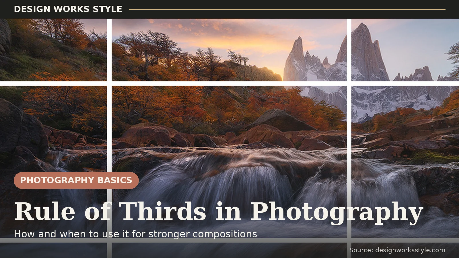
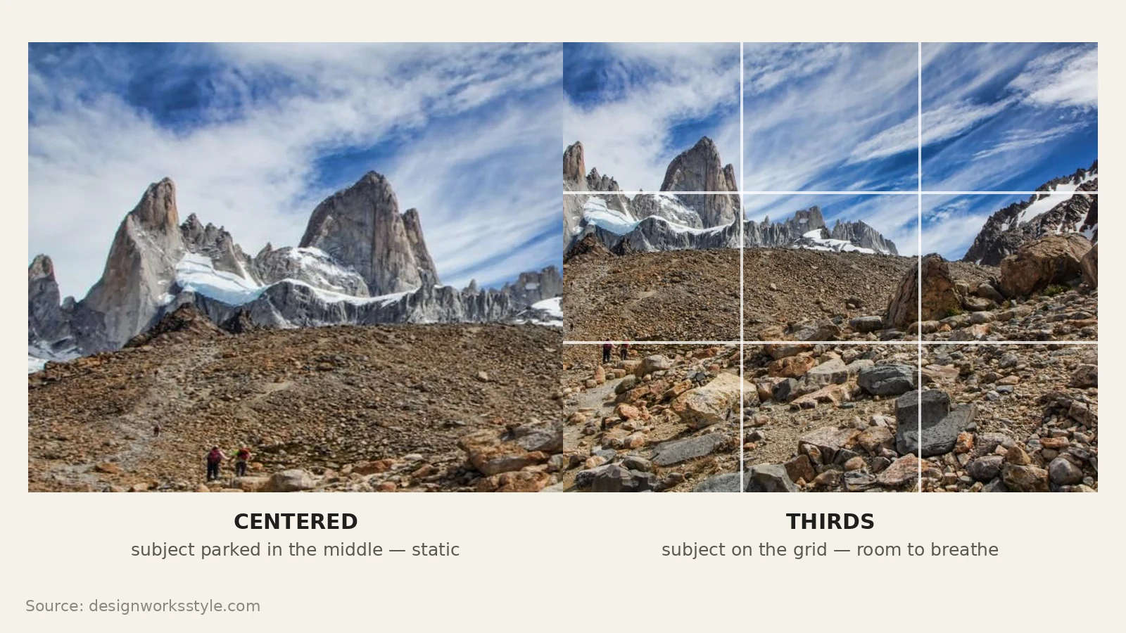
The rule of thirds is a composition guideline that divides your frame into nine equal sections with two horizontal and two vertical lines. Put your subject on one of those lines, or where two lines cross, and the photo usually looks more balanced than a centered one. Our eyes go to those intersection points first, which is why it works.
Once you see the grid, you start noticing it everywhere: in landscapes, portraits, even quick phone snapshots. This guide covers what the rule is, how to use it when shooting, the mistakes that make it backfire, and when to ignore it on purpose.
What the Rule of Thirds Is
Imagine a tic-tac-toe grid over your frame. The rule of thirds says to place key elements on the grid lines or their four intersections instead of the center. Off-center placement looks more balanced to most viewers. Treat it as a guideline. It works in most situations, and you will learn when to drop it.
The idea is older than photography. The artist John Thomas Smith described dividing a picture into thirds in 1797, and painters had done it intuitively for centuries. A centered subject gives the eye nowhere to travel. It lands in the middle and stops. An off-center subject creates gentle tension, and the empty two-thirds of the frame give it context and breathing room.
Most cameras and phones can display this grid while you shoot. On an iPhone it is under Settings > Camera > Grid. On Android it is usually in the camera app’s settings. On a dedicated camera, look for a grid display option for the viewfinder or screen. Turn it on and leave it on while you are learning. It costs nothing and trains your eye.
How to Use the Grid
Four steps: turn on the overlay, pick your main subject, move the camera until that subject sits on a line or intersection, then check the rest of the frame for distractions before shooting. The hard part is deciding what the photo is about before you press the shutter.
- Turn on the grid overlay.
- Identify your main subject (the thing the photo is about).
- Move the camera (or the subject) until that element sits on a grid line or intersection.
- Check the rest of the frame for distractions, then shoot.

Step two matters most. Name the single thing the photo is about: the person, the peak, the doorway. Give that element the intersection. Then scan the other two-thirds for distractions, like a bright trash can or a branch behind someone’s head. Move two steps left or right and half the distractions in the world disappear.
Placing People
For portraits, place the subject’s eyes near the upper horizontal line, ideally close to one of the top intersections. If the person is looking to one side, leave more empty space in front of them than behind. Photographers call this lead room. For full-body shots, align the person with a vertical third so the environment gets the remaining two-thirds.
Viewers look at the eyes before anything else, so the eyes are the true subject even when the “subject” is the whole person. Put them on the upper third and you avoid the floating-head effect of a face stranded mid-frame, with natural space below for shoulders and context.
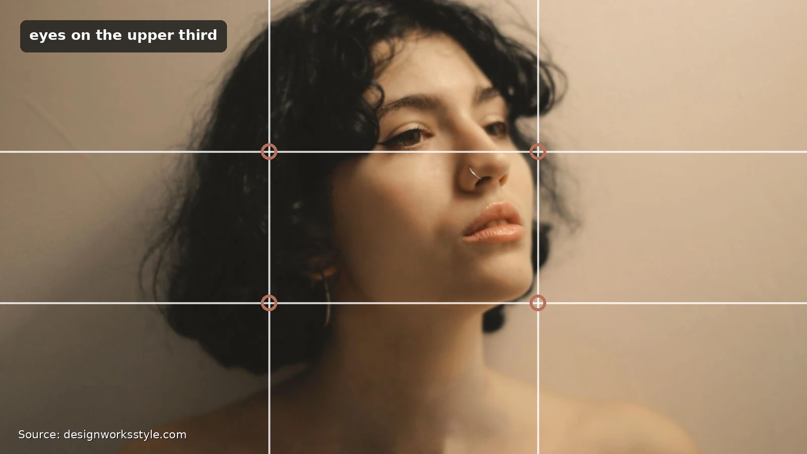
Lead room is the part people forget. When your subject looks left, give the left side the extra space. The portrait should feel like it has somewhere to go. A good check: the space in front of the face should be roughly double the space behind the head. For groups, line the row of faces along the upper third. For environmental portraits, put the person on a vertical third and let the other two-thirds show their world.
Placing Horizons
Put the horizon on the upper third when the foreground is the interesting part, and on the lower third when the sky is the star. Centering the horizon splits the photo into two competing halves and weakens both. Before shooting, ask one question: is this photo about the land or the sky? Give two-thirds of the frame to your answer.
Dramatic clouds or sunset color earn the lower third. A reflective lake, textured rocks, or a winding path earn the upper third. One rule has no exceptions: keep the horizon level. Use the grid’s horizontal lines as a level. A horizon on the perfect third but tilted two degrees looks worse than a centered, level one.
Using It With Landscapes
Landscapes reward the grid more than almost any other subject. Place a mountain peak, lone tree, or cabin on an intersection. Run shorelines or ridgelines along a third. Angle rivers or paths so they travel from one intersection toward another.
Think in three layers: foreground on the lower third, midground in the middle band, background up top. When each third carries its own layer, flowers low, lake across the middle, peaks and sky above, the photo gains a depth that a single sweeping vista lacks. Let leading lines do the work: a road entering at a bottom-corner intersection and exiting near a top one pulls the eye through the frame.
Using It With Phone Photography
Phone cameras are ideal for practicing the rule of thirds because the grid is one tap away and the camera is always with you. Turn on the grid, tap to set focus on your subject at an intersection, and compose deliberately when you shoot. A photo composed in thirds beats a centered shot rescued by cropping later.
Two phone-specific tricks. Tap and hold to lock focus and exposure separately, so a backlit subject on a third does not trick the phone into exposing for the background. And walk closer instead of zooming digitally.
Common Mistakes That Make Thirds Backfire
The grid fails when it becomes a formula. Shoving every subject onto an intersection without considering balance, light, or background is the main way it goes wrong. The usual mistakes: ignoring a messy background, placing the horizon on a third but tilted, and leaving dead space with no purpose. The grid arranges elements. It does not fix a weak subject or bad light.
- Dead space with no job. Two-thirds of empty sky is not “using thirds.” It is just empty. Negative space should balance the subject, lead toward it, or set a mood. If it does none of those, move closer.
- Two subjects, no hierarchy. A person on the left intersection and a dog on the right one splits attention, and the photo argues with itself. Give one element the intersection and let the other support it.
- Grid tunnel vision. Staring at the overlay so hard you miss the harsh shadow across the face. Compose with the grid, then do a final full-frame scan with it mentally switched off.
When Centered Composition Works Better
Center the subject when the scene is symmetrical, or when you want stillness and confrontation. Reflections, architecture, archways, and portraits with direct, intense eye contact all suit the center. Square formats tolerate centering better than wide ones.
A mountain reflected perfectly in a lake, a cathedral nave, a tunnel: centering doubles the symmetry. When a subject stares straight down the lens, dead-center placement turns the photo into a confrontation that thirds would dilute. When the subject demands your full attention, give it the full center.
When to Break the Rule
Break the rule of thirds when you can name the reason. Maybe you are isolating a tiny subject in vast negative space, creating tension by pushing the subject to the very edge, or filling the entire frame so there is no composition left to arrange. There is a difference between choosing to ignore the grid and not knowing about it.
Minimalism is the most reliable reason. A lone bird against a huge empty sky makes the emptiness the subject. Edge tension is bolder. Pushing a face to the frame’s edge creates unease or urgency, which is why it works in street photography. Fill-the-frame breaks the rule by eliminating the question entirely: macro shots and dense patterns have no thirds left to arrange. Learn the grid first, then break it deliberately.
A Simple Practice Exercise
Train your eye with a fifteen-minute drill. Photograph one static subject dead center, then on each of the four intersections, and compare all five on a bigger screen. Pick the strongest and write one sentence about why it wins. Repeat with a person and a landscape. After a dozen rounds, thirds placement becomes instinct.
- Pick one static subject: a tree, a building, a parked bicycle.
- Photograph it dead center. Look at the result.
- Photograph it on each of the four intersections (four more shots).
- Compare all five on a bigger screen and pick the strongest.
Round two: a person, adding lead room. Shoot one version with space behind them, one with space in front. Round three: a landscape, with the horizon on the upper third, lower third, and center. Make it a week-long habit, one subject a day. By day seven you will shift the camera half a step before shooting without thinking.
Frequently Asked Questions
What is the rule of thirds in photography?
It is a composition guideline that divides the frame into nine equal sections. Placing key elements on the grid lines or their intersections tends to create balanced, engaging photos.
When should you break the rule of thirds?
When symmetry, minimalism, or deliberate tension serves the photo better, and when you are making that choice consciously rather than by accident.
Does the rule of thirds work for portraits?
Yes. Place the eyes near the upper third line and leave space in the direction the subject is looking.
Is the rule of thirds the same as the golden ratio?
Related, not identical. The golden ratio (about 1:1.618) makes a slightly different, spiral-based grid. The rule of thirds is a simpler approximation that gets you most of the benefit with none of the math.
Turn on your grid and put what matters on the lines. Give the sky or the land its two-thirds. Break the pattern whenever you have a reason. Run the exercise with three different subjects this week and the grid becomes instinct. If you are building from scratch, our Photography Basics guide puts composition alongside exposure and light.