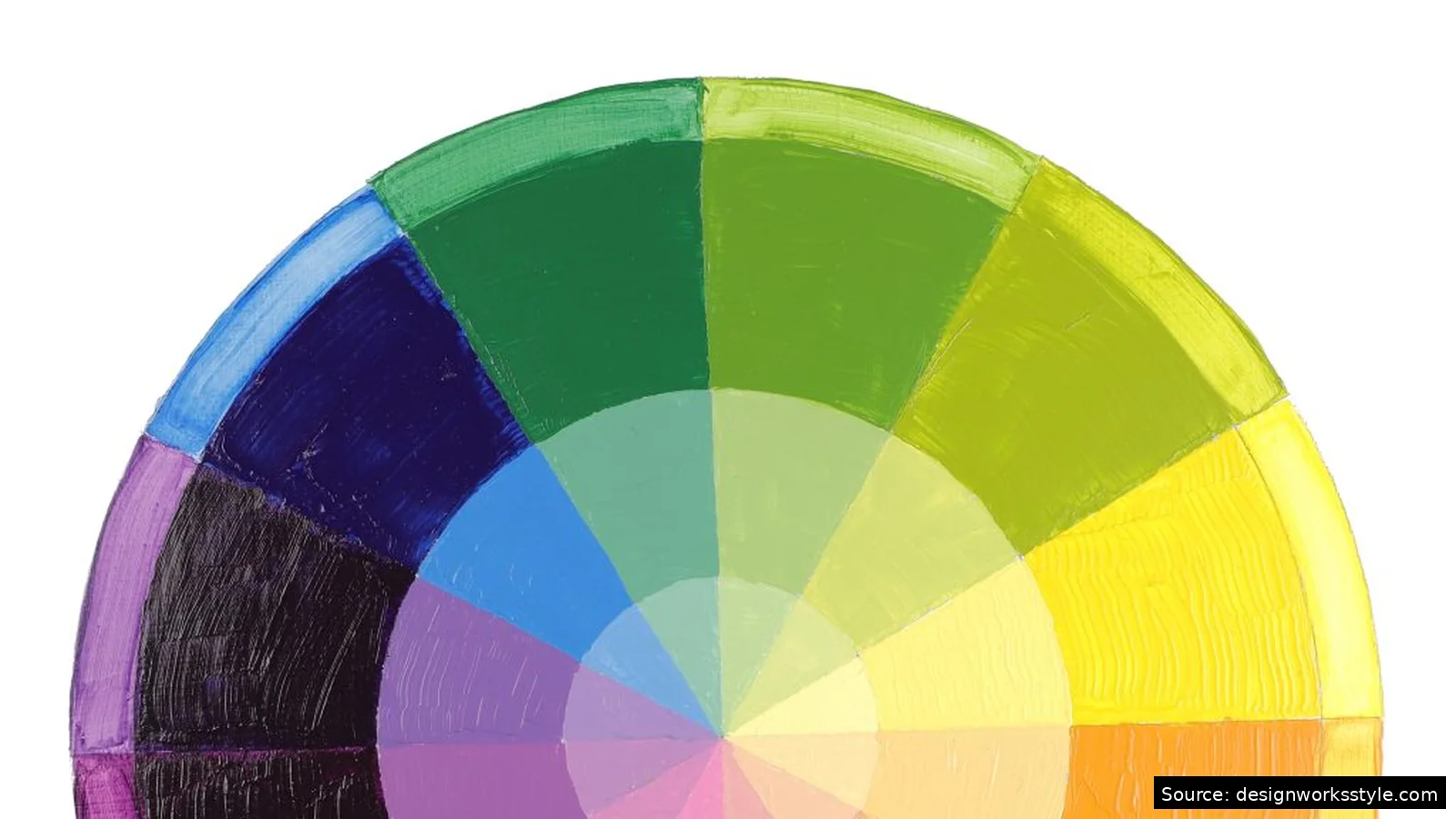

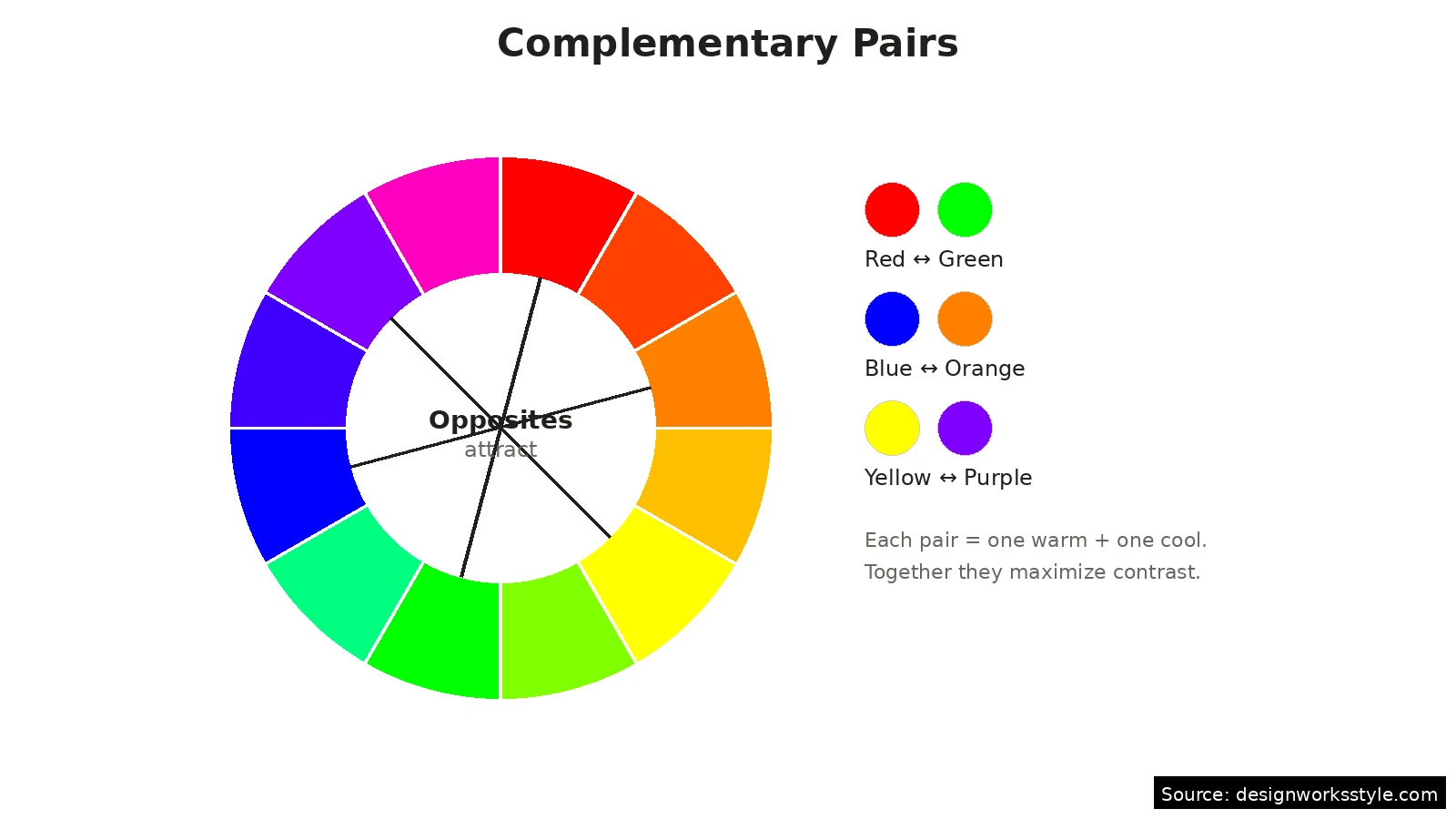
Complementary colors are pairs opposite on the color wheel: red-green, blue-orange, purple-yellow. Together, each intensifies the other, creating strong contrast and energy. They work best with one color dominant and the other as accent, ideally with one muted. At full strength in equal amounts, they vibrate and strain the eyes.
Every beginner meets complementary colors early, usually as a warning: do not put red text on a green background. But the same pairing, handled well, is behind some of the most striking design in sports branding, film posters, and interiors. The difference is proportion and restraint. This guide explains what complements are, why they behave the way they do, and the practical rules for using them without the headache.
What Exactly Are Complementary Colors?
Two colors are complementary when directly across from each other on the 12-color wheel. The classic pairs: red-green, blue-orange, yellow-purple. Each combines one warm and one cool color. Tertiary pairs work identically: red-orange complements blue-green. Find any color on the wheel; its complement sits opposite.
The concept comes from pigment mixing: complements are the pairs that neutralize each other to gray or brown when blended. That neutralizing property is the flip side of their contrast. Painters have known for centuries that a shadow is not just a darker version of a color but often contains its complement. In design, you rarely mix them physically, but the relationship still governs how the eye reads the pairing.
Why Do Complementary Colors Vibrate?
Complements vibrate at full saturation because the eye struggles to focus on two opposing wavelengths at once. Through simultaneous contrast, each color intensifies the other: red looks redder beside green. At text sizes this becomes uncomfortable; at large sizes with space, it reads as bold. Muting one color or adding white space between them calms the effect.
You can keep the energy and lose the discomfort by adjusting the pairing. Muting one color (navy instead of pure blue, terracotta instead of pure orange) preserves the contrast relationship while calming the vibration. Separating the colors with white space or a neutral buffer also helps: a thin white border between red and green elements stops the buzz almost entirely. The rule is simple: the closer together and the more saturated, the more they fight.
Always test complements in their final context, not as isolated swatches. A pairing that looks fine in a palette tool can misbehave on a backlit screen or under warm interior lighting. Print a proof, view it on the target device, or paint a test board. Screens intensify saturation, print dulls it, and room light shifts everything. The five minutes spent testing saves hours of revision later.
How Should You Proportion Complementary Colors?
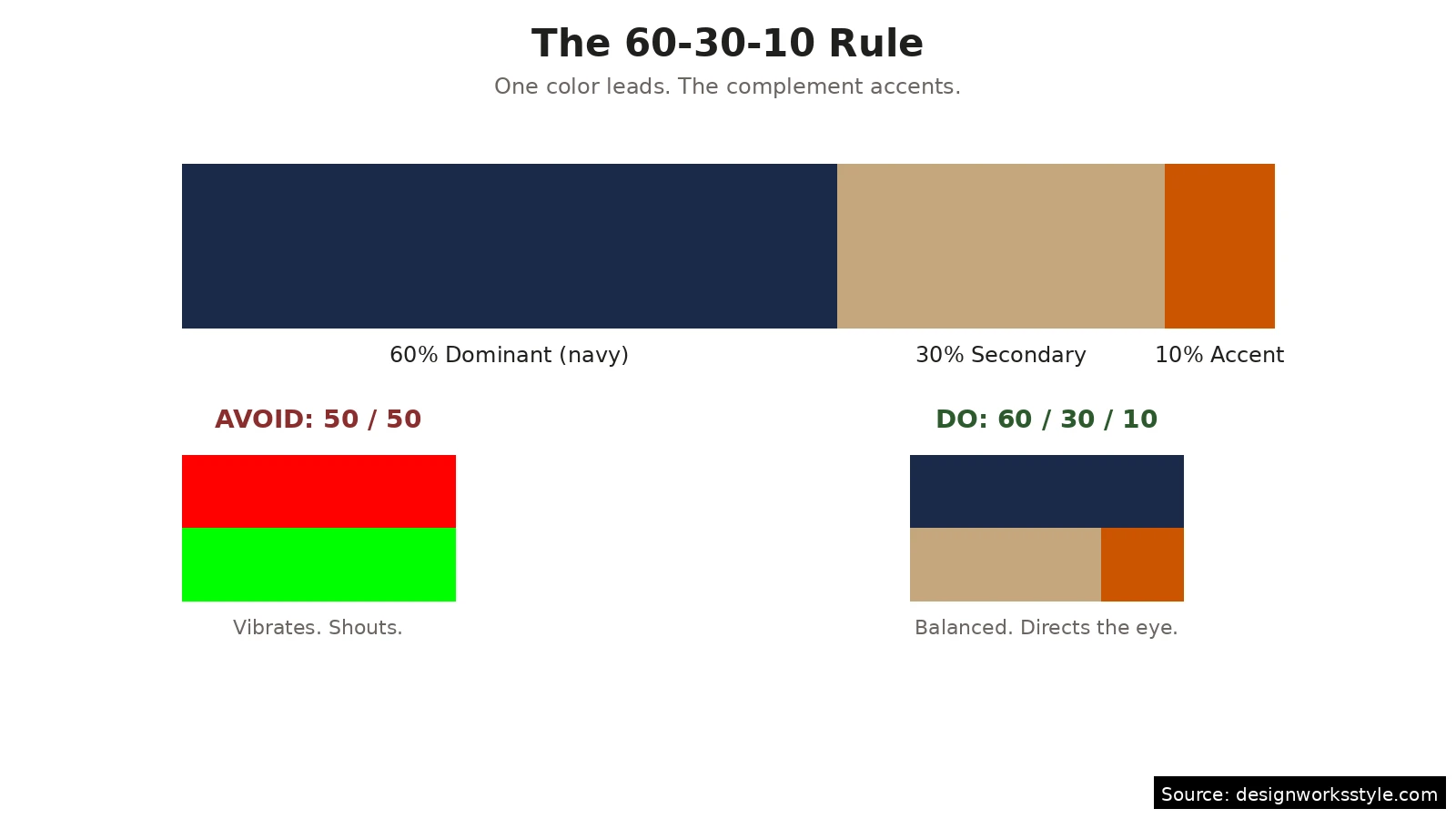
Follow 60-30-10: 60 percent dominant, 30 percent secondary, 10 percent accent, with the complement usually smallest. A navy room with wood floors and one burnt-orange chair works naturally. Equal splits look like sports teams. Also check value contrast: light yellow with dark purple reads well, while two medium-value complements turn muddy.
Value contrast matters as much as hue contrast. A light yellow with a dark purple reads clearly and comfortably because the lightness difference does half the work. Two complements at the same value (a medium red with a medium green) create the muddiest, hardest-to-read combinations. When a complementary pairing feels wrong, check the values before blaming the hues: darkening one or lightening the other often fixes what seemed like a color problem.
Where Do Complementary Colors Work Best?
Complements excel where something must stand out: calls to action, logos, sports branding, focal points. An orange button on blue gets clicked because the eye cannot ignore it. A red chair in a sage room becomes memorable. Film posters lean on teal-and-orange constantly. The pattern: small complement doses against a dominant field direct attention precisely.
In graphic and web design
Use the complement for the one thing that must be noticed: the buy button, the headline accent, the active state. Keep body text and backgrounds in the dominant color family with neutrals. Web designers should also remember that screens emit light, which intensifies saturated complements beyond how they look in print. Test button colors at actual size on a real screen, and check them in grayscale to confirm the contrast survives without hue.
In interiors and decor
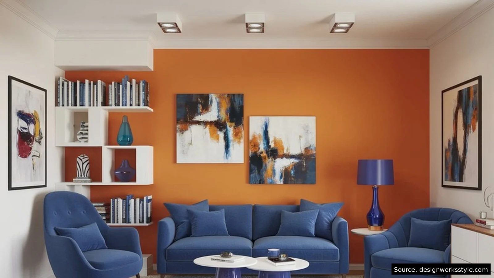
Rooms handle complements through texture and light, which naturally mute them. A blue sofa with rust-colored cushions works because fabric, shadows, and daylight soften both colors. The 60-30-10 rule maps neatly onto rooms: walls and large furniture in the dominant color, textiles in the secondary, and small objects (vases, art, a throw) in the complement. Live with a sample before committing: paint a board, move it around the room, and check it in morning and evening light.
What Is Split-Complementary?
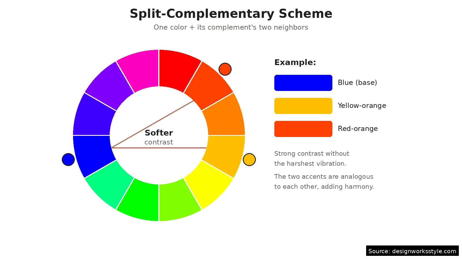
Split-complementary pairs one color with the two neighbors of its direct complement. Blue goes with yellow-orange and red-orange instead of pure orange. You keep strong contrast, gain a third color, and reduce vibration since the two accents are analogous. It is the scheme for when straight complements feel too aggressive but you still want energy.
This scheme is forgiving for beginners because the built-in variety hides mistakes. With three colors to distribute, the 60-30-10 rule still applies: dominant base, then split the remaining 40 between the two accents unevenly. Try a deep teal base with amber and coral accents, or a forest green with plum and rust. If the result feels busy, mute all three slightly; split-complementary at full saturation is still a lot of color.
Frequently Asked Questions
What are the three main complementary pairs?
Red and green, blue and orange, yellow and purple. These are the primary-secondary opposites on the 12-color wheel. Every other complementary pair follows the same logic at the tertiary level: red-orange with blue-green, yellow-orange with blue-purple, yellow-green with red-purple.
Why does red and green look like Christmas?
Because it is a 50-50 complementary pairing at high saturation, exactly the combination culture has coded as Christmas through decades of decoration. The association is so strong that any balanced red-green design reads as holiday-themed regardless of intent. To use the pair without the association, shift the proportions hard (mostly green with a red accent) or mute one color toward burgundy or sage.
Can complementary colors work in a calm design?
Yes, if you mute them. A dusty blue with a clay terracotta is technically complementary but reads as calm and earthy because both colors are desaturated. Lowering saturation keeps the pleasing contrast relationship while removing the visual shouting. Most “neutral” interiors are actually muted complementary schemes: warm beiges against cool gray-blues, with the contrast doing quiet work.
What is the biggest mistake with complementary colors?
Equal proportions at full saturation, especially with text. Red text on a green background (or the reverse) is the classic example: it vibrates, it is hard to read, and it looks amateur. Fix it with the 60-30-10 rule, muted tones, and enough value contrast that the design works even in grayscale.